WordPress Image Optimization: The Practitioner Playbook
WordPress image optimization is the work of shrinking image bytes and fixing how they render so pages load fast without looking rough. The setup that actually moves the needle is real display dimensions, WebP or AVIF conversion, responsive srcset, lazy loading below the fold, width and height for CLS, and a preloaded hero that's never lazy loaded.
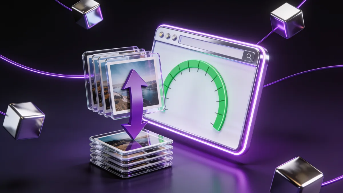
WordPress image optimization is the work of shrinking image bytes and fixing how they render so pages load fast without looking rough. The setup that actually moves the needle is real display dimensions, WebP or AVIF conversion, responsive srcset, lazy loading below the fold, width and height for CLS, and a preloaded hero that's never lazy loaded. If I were checking this on a real site, I'd start with the page that earns traffic or money, confirm whether the issue is backend, frontend, content, or layout related, then apply one fix at a time.
What is WordPress image optimization?
WordPress image optimization is the process of reducing image file size and improving how images load so your pages feel fast without the pictures looking soft or blocky. It's three jobs stacked together: cutting bytes (compression and next-gen formats), serving the right size to each device (resizing and responsive srcset), and controlling load order so the visible image paints first while everything else waits.
Here's why I lead with images on almost every audit I run. On a typical content page, media is the single biggest chunk of what the browser downloads, and the hero image is the Largest Contentful Paint element more often than not. So if you don't fix images, you can't fix the score. The good news is this is one of the highest-impact things you can touch: I've seen a homepage drop from 1.4 MB to under 400 KB just from resizing and converting, with no visible quality loss.
If you're chasing a green Core Web Vitals result, images touch all three metrics. They drive LCP when the hero is heavy, they cause CLS when width and height are missing, and oversized files steal main-thread time that hurts INP on slower phones. I'll walk through each of those, but the framing matters: you're not just compressing files, you're managing what paints and when. For the metric-by-metric deep dive, my WordPress LCP optimization guide goes further than I can here.
Which image format should you use, WebP or AVIF?
Use WebP as your default and reach for AVIF only when you've tested it on your real images and your delivery tool serves a JPEG fallback for old browsers. WebP runs about 25 to 35 percent smaller than JPEG at the same visible quality and now has roughly 96 percent browser support, so it's the safe, boring choice that just works. AVIF can land another 20 to 30 percent smaller than WebP, which is real money on a photo-heavy page, but encoding is slower and a few edge-case browsers and email clients still trip on it.
My decision rule after years of this: if your plugin or CDN can auto-serve AVIF with a WebP or JPEG fallback through content negotiation, turn AVIF on and let the browser pick. If it can't, or if you're hand-exporting images, stick with WebP and don't overthink it. The byte difference between a good WebP and a good AVIF is rarely worth a broken image on a customer's older device.
Keep PNG only where you actually need lossless transparency, like a logo with hard edges, and even then a properly compressed WebP usually beats it. SVG is its own category: it's perfect for logos and icons because it scales to any size with almost no weight, but never let untrusted users upload SVGs since they can carry scripts. If you want the whole next-gen story in one place, the render-blocking resources guide pairs well with this because fonts and icons often hide in the same critical path.
Why does resizing matter more than compression?
Resizing matters more than compression because a 4000 pixel photo squeezed into a 600 pixel slot is still downloading 4000 pixels of data the visitor will never see. Compression shaves a percentage off whatever you give it; resizing changes the order of magnitude. This is the single most common mistake I find: people install a compression plugin, watch it report savings, and never notice the underlying image is six times wider than its container.
The fix is to cap dimensions to what your layout actually displays, then compress on top of that. Here are the ceilings I use as a starting point: full-width hero around 1920 pixels wide, in-content blog images around 1200 pixels, product images 1000 to 1200 pixels, and thumbnails at 300 by 300 (double that if you're targeting retina). A plugin like Imsanity or the resize feature in ShortPixel can auto-cap on upload so nobody on your team ever ships a 5 MB camera file again.
On quality, I sit lossy compression around 75 to 82 percent for photos. That's the band where the eye stops noticing artifacts but the bytes keep falling. A concrete example from a recent job: an 801 KB JPEG hero became 54 KB at lossless and 22 KB at sane lossy, and you couldn't tell the difference at arm's length. Aim for under 100 KB per content image, under 200 KB for a hero, and under 50 KB for thumbnails, and you'll rarely have an image problem again.
How do you serve responsive images with srcset?
You serve responsive images by letting WordPress generate multiple sizes and emit a srcset attribute so each device downloads the size it needs instead of one giant file for everyone. The browser reads srcset plus the sizes hint and picks the smallest image that still looks crisp at that viewport. WordPress has done this automatically since version 4.4, so the foundation is already there for any image inserted through the editor.
The catch is that srcset only works with the image sizes your install actually generates. If your theme registers a 768 and a 1024 width but your content slots are 600 and 1200, the browser keeps over-fetching. So check Settings, Media for your thumbnail, medium, and large dimensions, and confirm your theme's add_image_size calls match your real layout. A regenerate-thumbnails pass after any change rebuilds the missing sizes for images you uploaded before the fix.
Page builders are where this quietly breaks. Elementor and Divi often output a single hardcoded full-size image instead of a proper srcset, which is why builder pages so often fail "properly size images" in PageSpeed Insights even with a compression plugin installed. If that's you, my best WordPress speed plugin breakdown covers which optimizers force correct responsive output on builder sites, and a full speed pass on a builder usually pays for itself fast through my page speed optimization service.
Should you lazy load every image?
No, you should never lazy load the image that's visible when the page first paints, because lazy loading delays it on purpose and that delay shows up directly as a slower LCP. Lazy loading is brilliant for everything below the fold: those images don't download until the visitor scrolls near them, which on a long page can cut initial load by 50 to 70 percent. WordPress adds native loading="lazy" since version 5.5, so most of your library is already covered.
The trap is the hero. WordPress and many plugins will happily slap loading="lazy" on the very first image, including your LCP element, and tank the metric you're trying to fix. So the hard rule is: the LCP image gets loading="eager" (or no lazy attribute at all), and every image past the fold gets lazy. Most serious plugins let you exclude the first one or two images, or skip-lazy by CSS class.
Here's the combo I apply to every hero, and almost nobody documents it as one move: skip lazy loading on it, add fetchpriority="high" so the browser fetches it before lower-priority assets, and preload it in the page head if it loads via CSS background or a builder where the browser discovers it late. Those three together routinely pull a second or more off LCP on real sites. If lazy loading and LCP feel tangled, the LCP guide untangles the load order in detail.
How do image dimensions stop layout shift?
Setting explicit width and height on every image stops layout shift because it tells the browser exactly how much space to reserve before the file arrives, so nothing below jumps when the image finally loads. Missing dimensions are one of the top causes of a failing CLS score, since the browser lays out the page with a zero-height image, then shoves everything down once it knows the real size.
WordPress adds width and height automatically for images placed through the block editor, which is why core content usually behaves. The shifts almost always come from theme template images, page-builder widgets, ad slots, and embeds that render without attributes. Run a page through PageSpeed Insights, expand "Avoid large layout shifts," and it names the exact element that's jumping so you don't have to guess.
The modern way to handle this in CSS is to keep width and height attributes on the tag and add height: auto in your stylesheet so the image stays responsive while the browser still reserves the right aspect ratio. If your CLS is still red after dimensions are in place, the culprit is usually fonts or late-injected banners, and my WordPress CLS fixes guide walks through finding those. CLS is the one metric where a five-minute fix often flips a page from red to green.
Should you convert images with a plugin, your server, or a CDN?
Pick based on where your bottleneck is: use a CDN-based optimizer if your server is slow or your TTFB is shaky, a server-level converter if you're on a fast host that supports it, and a plugin if you want full control of the originals on your own disk. They all reach the same destination, smaller next-gen images, but the route changes who does the work and where the strain lands.
Plugins like ShortPixel, Imagify, EWWW, and Smush compress and convert inside WordPress and store the results in your uploads folder. That's great for control and bulk-optimizing an existing library, but conversion runs on your server, so a cheap shared host can choke on a big batch. If your TTFB is already over 0.8 seconds, pushing thousands of conversions through that same server is asking for timeouts, and you'd be better fixing the host first with my TTFB optimization guide.
CDN optimizers like Optimole and Cloudflare's image options convert and resize on the edge, on the fly, so your origin never does the heavy lifting and visitors pull images from a server near them. On LiteSpeed hosting, LiteSpeed Cache can generate WebP at the server level for free, which is my default recommendation there because it's one less moving part. My decision rule: slow or cheap host, go CDN or edge; fast host you already trust, server or plugin is simpler and keeps the files yours. For the network side, the Cloudflare speed guide covers edge image handling.
As for which specific plugin, ShortPixel and Imagify are my go-to local optimizers. Both do WebP and AVIF, both bulk-optimize existing images, and Imagify pairs naturally with WP Rocket if you're already in that stack. Imagify gives you 200 free optimizations a month and ShortPixel 100, which is plenty to test before you commit. EWWW is the budget pick because it can compress unlimited JPEGs locally for free, and Smush is the friendly all-rounder with over a million installs, though its free tier is more limited than the marketing suggests. Optimole is the one I reach for when the server is the problem, since it offloads everything to its own CDN. One firm rule: run exactly one image optimizer, because two plugins double-compressing the same files is a classic way to wreck quality and waste credits. My speed plugin guide shows how image tools slot in next to caching and CSS tools.
How do you diagnose image problems in PageSpeed Insights?
You diagnose image problems by reading four specific PageSpeed Insights opportunities, since each one points to a different fix and tells you exactly which file is to blame. This turns a vague "my images are slow" into a short, ordered to-do list instead of guesswork.
Watch for these four. "Serve images in next-gen formats" means you're shipping JPEG or PNG and need WebP or AVIF. "Properly size images" means an image is bigger than its display slot and needs resizing, which is the builder problem from earlier. "Defer offscreen images" means below-fold images aren't lazy loaded yet. And "image elements do not have explicit width and height" is your CLS warning. The LCP section names your hero, and if it shows your largest image is lazy loaded, that's your number-one fix.
Always test on the mobile tab, because mobile is throttled and scored harder, and it's where image weight does the most damage. Run the page before and after each change so you can see the score move and prove the fix worked. If you want a guided walkthrough of the whole report, point my free WordPress audit tool at the page and it'll flag the image issues alongside everything else, and the PageSpeed Insights guide explains what every line means.
How do you optimize an existing media library?
You optimize an existing library by running a one-time bulk pass with your chosen plugin, which compresses, converts, and (if the tool supports it) resizes every image already sitting in your uploads folder. New images get handled automatically on upload, but the years of unoptimized files already on the site won't fix themselves, and on an older blog that backlog is often the biggest single win available.
Before you start, take a backup, because bulk optimization rewrites files and you want a rollback if a setting was wrong. Then kick off the bulk process during a quiet traffic window, since conversion is CPU-heavy and a large library can run for hours on shared hosting. Most plugins keep the originals so you can restore, which is worth confirming before the first run rather than after.
Watch out for a bloat trap: storing original, scaled, WebP, and AVIF copies of thousands of images can balloon your disk usage and slow your backups. Prune the image sizes your theme never uses, and once a library is converted, run a database cleanup too because orphaned attachment metadata piles up fast. My database optimization guide handles that side, since a heavy media library and a bloated database usually travel together.
Does image optimization help SEO?
Yes, image optimization helps SEO in two distinct ways: faster pages strengthen the Core Web Vitals signals Google uses, and well-described images earn traffic from image search and improve accessibility. Speed is the bigger lever for most sites, but the on-page side is nearly free once you build the habit.
Write real alt text that describes what's in the image for someone who can't see it, not a keyword dump. Good alt text helps screen-reader users and gives search engines honest context, while stuffed alt text helps nobody and can read as spam. Give files descriptive names before upload too, because "blue-running-shoes.webp" tells a crawler more than "IMG_4821.jpg" ever will.
Don't expect alt text alone to move rankings, that's a myth I have to correct often. The performance gains from proper sizing and next-gen formats do far more for search than any caption ever will, since speed feeds directly into mobile experience scoring. If image weight is also dragging your phone scores, the fix WordPress mobile speed guide is where the two topics meet, because mobile is where heavy images hurt rankings most.
What image optimization mistakes should you avoid?
The mistakes that quietly kill image performance are compressing without resizing, lazy loading the hero, and shipping one huge file to every device. Each one is easy to make and each one cancels out the work you did everywhere else, which is why I check for all three on every audit before touching anything fancier.
Compressing without resizing is the big one, since you're optimizing a file that's still wildly oversized for its slot. Lazy loading the LCP image is the sneaky one, because the plugin reports success while your hero loads slower than before. And serving a single 1920-pixel image to a 360-pixel phone wastes the responsive system WordPress already built for you. A fourth I see weekly: running two optimization plugins at once, which double-compresses and burns through credits.
The fix for all of them is order of operations: resize first, then compress, then convert to next-gen, then handle load priority. Set explicit dimensions so CLS stays flat, exclude the hero from lazy loading, and let srcset do its job. Do those in that sequence with one plugin and you've already beaten most sites in your niche. If your scores still won't budge after a clean image pass, the bottleneck has moved elsewhere, and a focused speed optimization engagement finds whatever's left.
My checklist
Find largest image files and templates.
Check whether images display larger than needed.
Review WebP or AVIF delivery.
Confirm LCP image is not lazy loaded.
Check missing width and height values.